There’s a lot to do when opening a restaurant. You need to create a business plan, find a location, hire staff, and create a menu that reflects your theme. Once you’ve created some fabulous dishes that you can’t wait to cook up for your customers, the next step is to create an actual menu so that you customers can decide what to order. This might sound like an easy task, but more goes into it than you think.
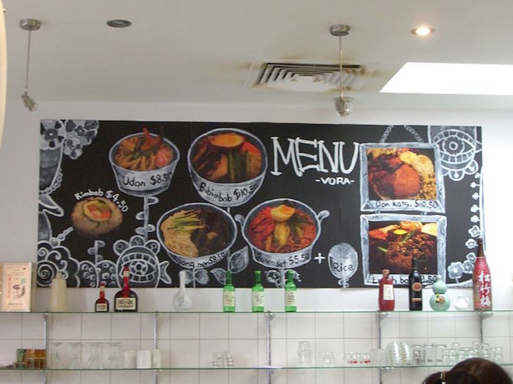
Before You Start. Before you create a document with a list of your menu items, you need to decide what type of menu works for your restaurant. Think about all the restaurants you’ve been to, and all the menus you’ve looked at over the years. There are literally hundreds of ways you can list your food, and some are better than others. You can create a single piece of paper with a plainly typed list of menu items, you can create a laminated book style menu with pictures and even stories. Depending on the type of establishment you have, you may not even need a printed menu, instead opting to simple create a mural sized chalkboard on the wall where diners can easily choose what they want. Point is, menu design is not something to take lightly.
It helps to know what your competitors are doing, so a good place to start is to look at websites or even visit restaurants and pay close attention to menus. Keep in mind that a menu you look at on a website is not likely going to be the same as what you see in a restaurant.
The Perfect Menu. Before you try to create the perfect restaurant menu, you first need to ask yourself what you’re trying to accomplish with your menu. At it’s core a restaurant menu is nothing special. It’s simply a way for diners to see all of the items you have to offer so that your staff doesn’t have to recite it with each customer. The perfect menu is one that is forgotten the minute the waitstaff takes it away. If it’s not, then you’ve done something wrong. So why are you spending a lot of time and energy into something that you want your customers to forget? Because in most cases, a restaurant menu is remembered or looked at again for negative reasons. If a menu is hard to read, or doesn’t include necessary ingredients (leaving bacon out of a vegetable soup description), it can start off a meal on the wrong foot.
The perfect menu for you is one that allows diners to order seamlessly and know exactly what they’re getting; it’s really that simple.
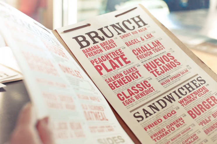
Pay Attention to Details When Designing Your Menu. The details will make or break your restaurant menu. Remember, a menu should not be difficult to navigate, impossible to read, or distract from your food. Most menus are broken down into categories, such as appetizers, salad, entrées, and dessert. They’re listed in the order they would be served, and this menu design generally works out well. If you offer a lot of dishes, you can break it down further by ingredients (chicken, beef, vegetarian) or type of dish (steaks, pasta, pizza) to help your guests filter out what they know they don’t want. You can also separate meal times, so you have a menu for lunch and dinner. You may even have a special brunch menu. You’ll likely find that the more items you offer, the more difficult it becomes to create an easy to read menu, and it can be more difficult for your guests to order what they actually want.
Once you find a layout that you like, you’ll need to choose a color scheme and font. Don’t take this lightly! The best menus are easy to read, but how easy something is to read depends on the lighting in your restaurant, as well as the person reading it. If the lighting in your restaurant changes from lunch to dinner, you need to make sure your menu can easily be read in both settings. Likewise, if your average diner is over 65, having a tiny font on your menu will likely turn off most of your customers.
Photos are not necessarily a bad addition to your menu, but think carefully about what your pictures are and where they are located. Adding a picture to the background of your menu can make it hard to read, but interesting photographs that are small and well placed can be a nice touch.
Think it’s a good idea to photograph your food to include on your menu? Proceed with caution. Food is very difficult to photograph, and not all dishes photograph well. A well written description can be a much better way to entice someone to order something, rather than an ill thought out photograph. Not to mention, if the dish that comes out of the kitchen doesn’t look like the photograph, diners will be disappointed. If you think it’s in your best interest to add photos of your food to your menu, hire a professional to do it right and give you guidance.
Get Your Pricing Right. By the time you’re creating a menu, you’ve probably got an idea of what you will price your food at, but how do you display it on the menu? There are many ways to list the prices on your menu. You can put list them numerically ($12, $12.00), use words (twelve dollars), leave off the dollar sign, or simply not display prices at all.
There are numerous studies on the effects of menu pricing techniques, and all of them make a difference in what diners order and how your restaurant is perceived. Leaving the price off your menu is only good if you know most of your diners are wealthy and will order solely based on what they want. If you’re a casual restaurant that caters to families, leaving the price off your menu is likely to cause stress to those who order somewhat based on price.
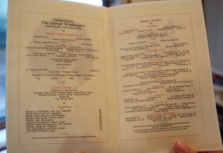
Be Descriptive. When creating your restaurant menu, it pays to write descriptions that not only detail key ingredients in the dish but also make a menu item sound amazing. For example, “Salmon with Balsamic Vegetables” doesn’t sound nearly as enticing as “Pan seared filet of wild salmon over balsamic roasted peppers, summer squash, and baby carrots” does it? Be descriptive, but don’t overdo it. You don’t need to include every single ingredient in the recipe, but make sure to include anything that might be one of the most common food allergens, or mention meat in something that might sound vegetarian otherwise (bacon in a salad, for example.)
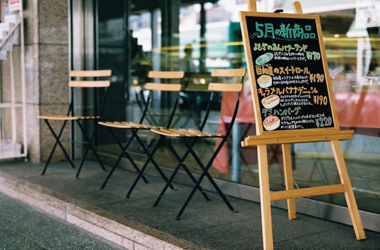
Keep it Simple.menu The best menus are those that are simple. You don’t want your customers to have to sit and read a menu for a half hour before ordering. Not only is it frustrating for them, but the longer they sit there, the fewer tables you can turn over.
Menus that have too many lists (sides, substitutions, add ons), choices (cheese, dressing, sauce) or starred items (vegetarian, gluten free, low fat) are too complicated and can overwhelm someone trying to get a simple meal.
Don’t use complicated words when simple will do. Saying “lardons” instead of “bacon” can sound pretentious in the wrong atmosphere, and will do nothing but prompt questions. If you’ve got an ethnic menu, try to simplify what each dish is without Webster type definitions. Remember, it’s a restaurant menu, not a book.
A good restaurant menu is one that is simple, easy to read, and lets diners know what expect without surprises. Creating one is not as simple as putting words on a page, and should not be taking lightly.
What kind of tips do you have for creating a fantastic looking menu?


